

Basic Monitor Calibration
This page is designed to help you set your monitor correctly for previewing graphics for general web or media distribution. It is not an exhaustive calibration resource but will 'get the job done' for most basic requirements.
The page background has been adjusted to improve viewing of the targets.
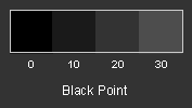
You should be able to distinguish between the patches marked 0 and 10 in the above sample. Patch 0 should be perfectly black, matching the borders of your monitor, and patch 10 should be barely visible. If you can not distinguish any difference between patches 0 and 10 then your monitor is likely set too dark. Adjust only the brightness control of your monitor until it you can just distinguish the difference between patches 0 and 10 but try to keep patch 0 as black as possible
For the techies...everyone else can skip to the next section
When the black point is properly set, an RGB value of #000000 or (0,0,0) will appear as true black on your monitor. Increase the RGB value slightly and you should see a slight increase in intensity. The non-scanned area surrounding the displayed image is an ideal reference for the black point. The goal is to make display value #000000 or (0,0,0) match the black of the non-scanned border.
For adjustments to be accurate you need to use consistent lighting when viewing your monitor. The black point for a brightly-lit room will be higher than a dimly-lit room. After setting room lights to your standard, minimize any on-screen applications (including your browser). If there are bright-colored icons on your desktop, move them to a folder and minimize the folder. You can easily retrieve them later. It is very important that your screen be completely black.
Set the desktop background color to black (0,0,0). To set the background color in Windows, choose Start > Settings > Control Panel, double-click on Display, and click on the Appearance tab. You can verify the RGB value is (0,0,0) by double-clicking on the color patch to view the Color Picker dialog box.
Set brightness and contrast to 100%. Adjust the vertical dimensions of the screen so you can easily distinguish the border between the scanned and non-scanned areas. To make this adjustment, shrink the view vertically, or move the view up and down with your monitor controls. This will expose the non-scanned area. If you shrank the window 2" from the top, then the border between the scanned and non-scanned area should be 2" down on your screen.
Decrease brightness until the the scanned area blends with the non-scanned area. If there is a dialog box for monitor brightness, and it is distracting, mask it so it doesn't interfere with this step. Go back and forth until you've identified the point where the scanned area starts increasing in intensity. Lock the setting when the scanned area just starts to become visible.
for everyone else - you're done!
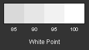
You should be able to distinguish between the 95% and 100% patches in the above grayscale. If they appear to be the same, then contrast is too high, and highlights are blocked. Most monitors work fine with contrast set at 100%. If you find this too bright, or highlights are blocked, decrease contrast and recalibrate the black point.
The sRGB standard specifies a color temperature of 6500°. Most monitors have provisions for setting color temperature using on-screen menus. You may find 6500° a bit warm. Feel free to adjust this value so that whites are white on your monitor.
You must use software to make gamma corrections. A change in gamma changes the shape of the brightness curve (see section on Theory). Most operating systems support a Color Management System (CMS) that allows you to control display gamma. An exception is NT4. If you're running NT4, you may want to upgrade to Windows 2000 for better color control. If you're using Adobe Photoshop, you can adjust gamma using Adobe Gamma. On a Windows computer, click on Start > Settings > Control Panel, and double-click on the Adobe Gamma icon. De-select the View Single Gamma Only checkbox, and adjust each color individually. As a double-check for Adobe Gamma, verify that there is no color tint in the following grayscale.
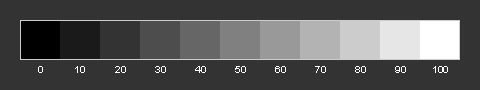
You can use the following chart to determine monitor gamma for your system. Stand ten feet from your monitor and choose the patch that blends with the background. For web use you'll want a gamma of 2.2, the sRGB standard. The sRGB color space also works well for inkjet printers.
If gamma is around 2.5, you're viewing the web through dark glasses. If gamma is near 1.8, then images on the web appear too bright. (Actually if you gamma is 1.8 this is standard for a Mac. If so, and if you're going to be creating images for the web, be sure to preview your work at a gamma of 2.2. Otherwise, images that look correct on your monitor, will be too dark for the other 95% of the world)
As a final pass in Adobe Gamma, select View Single Gamma Only, and view this chart while making minor adjustments. As you move the gamma slider, you'll see the display darken and lighten. You are altering the look-up table (LUT) that controls monitor display. The RGB value of the smooth patches remains the same, but they're interpreted to a different brightness as you move the slider.